

bnlfglfmbjfod DM@LM z{tmzh
We began in the early ’90s — when video ruled and the internet was just emerging.
Storytelling has always been the backbone of our apporach. We use it to simplify complexity and give ideas the clarity they deserve.
We partner with leaders in health & life science, STEM & education, and society & sustainability, delivering:
+ Branding
+ Campaigns
+ Educational tools
+ Events & exhibitions
+ Internal communications
+ Promotional assets
Reframing the Pause as Possibility
Our brief
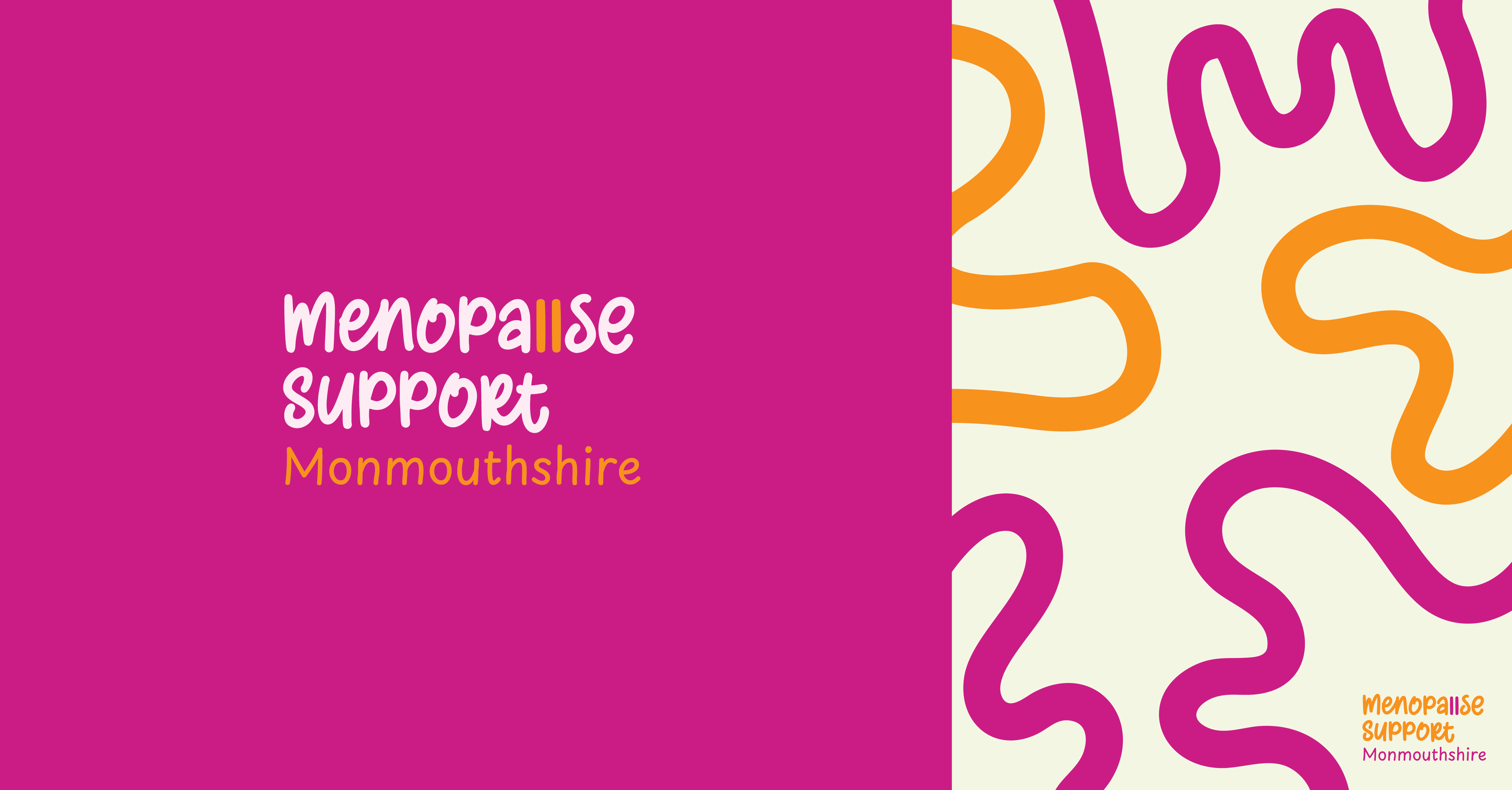
The Big Idea
“In every pause lies new possibility.”
The Colours
- Hot Pink — a nod to the heat of hot flashes, but also boldness, sensuality, and unapologetic femininity.
- Plum — deep and grounding, a space for reflection, calm and emotional depth.
- Blush — gentle and nurturing, representing compassion and care.
- Carrot Orange — Bright, joyful, and full of life — the spark that speaks to energy and possibility.
The Feel
“I am completely thrilled and overwhelmed with the rebranding — it gives such a positive and impactful shift in communication. It feels fresh, optimistic, and relatable — modern yet warm and empathetic.”
“Words can’t thank you enough — I am just totally in love with my brand. It’s incredibly inspirational, on point, and way, way ahead of the competition.”
Leave a Comment